Interface
A short tour of where things are before you grow your first tree. If you haven't installed yet, start with Installation.
First run
The first time Natsura starts, the Welcome Screen asks a few questions. You can change every answer later in Settings.
- Whether to send anonymous usage data. The privacy policy is linked from the window.
- Whether to load the Natsura layout at startup, which opens Houdini into the Natsura desktop.
It ends by offering to grow your first tree, which opens the Simple template: a Grow feeding a Simulate, ready to shape.
Welcome Screen and Project Browser
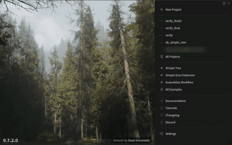
The Welcome Screen is where you start a new project, reopen recent work or open an example. It can be docked in a pane tab, and Settings has a toggle for showing it at startup.
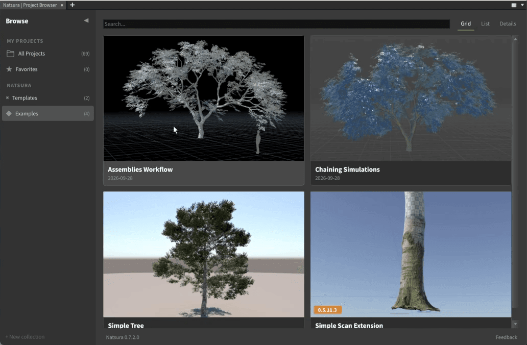
The Project Browser holds your projects, templates and examples, with collections, favourites and versions. Opening an example opens a copy as a new project, so the shipped scene never changes. New Project offers the templates, Blank and Simple.
The Natsura desktop
If you said yes to loading the Natsura layout, Houdini opens into the Natsura desktop: the viewport, parameter pane and network view, with the Natsura panels docked beside them. Every Natsura panel can float or dock like any Houdini pane, so the desktop is a starting point rather than a fixed layout.
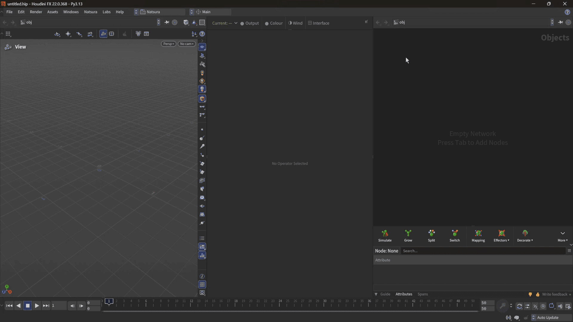
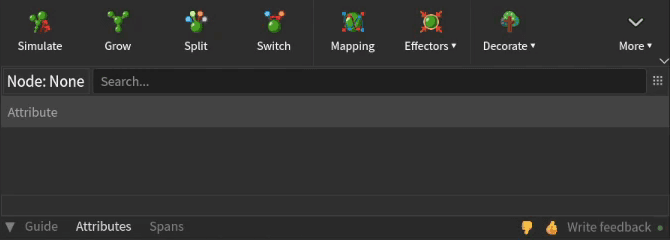
Below the network view is the Natsura workspace. The toolbar along its top adds nodes and runs actions on what you have selected. Below the toolbar are tabs for the Guide; Attributes, for inspecting the attributes flowing through the growth graph; and the Spans panel, which lists the effectors, decorations and maps in the scene and which nodes use each, like a modifier stack for your nodes. Collapse the tabs to keep only the toolbar, or right-click a tab to pop it out as a floating panel. The display toolbar sits above the parameter pane.
The Guide
The Guide is in-app help that follows what you are doing. Hover a tool or select a node and its page appears.
Pin freezes the current page, and the help button opens the matching page on this site. The help buttons on Grow and Map open the Guide too.
At the bottom of the workspace there are also feedback buttons and a dot that shows whether usage data is being sent. Hover the dot to see what is queued, or to turn it on or off.
The display toolbar
On the display toolbar, Output and Colour set how every Simulate in the scene is drawn; the rest set the preview wind and parts of the interface:

- Output: Meshed, Shaded or Skeleton. This is the same switch as Output Mode on the Simulate (Decorated, Preview, Skeleton), set on every Simulate at once.
- Colour: Show Geometry Colour, Show Node Colour, or No Colour.
- Wind: Calm, Breeze or Strong. This sets a preview wind on a Wind Environment node at object level.
- Interface: Graph for dependency links in the network view, Background for the viewport background, and Desktop, which reloads the Natsura desktop layout or shows and hides the stowbars.
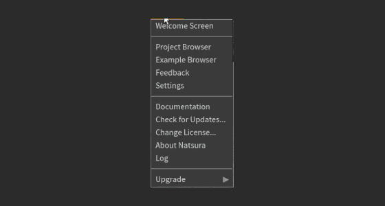
It also has a Simulate selector. One graph can feed more than one Simulate, so the selector sets which Simulate a Grow or decoration previews in. The Natsura logo at its right end opens the Project Browser, Example Browser, Feedback, Settings and the Welcome Screen.
The Natsura menu
The Natsura menu in Houdini's main menu bar has the same panels, plus Documentation, Check for Updates, Change License, About Natsura (system and version details you can copy for support) and Log. Upgrade Scene and Upgrade Selected Node(s) bring scenes made with older versions up to date; see Upgrading.
Next
Grow something: Your First Tree.
Status
The preview wind only shows where a Visualize Assemblies node displays the tree, as inside Assembly Resource and Rig to Assembly, and on a displayed Wind Config. Anything else stays still for now.